Responsive Images
Responsive images (via picture-element)
The only restriction: all (before, after) responsive images must have exactly the same size and the media queries must match (see below).


Sweden - Stockholm, sunset (color grading)
Responsive images (via srcset attribute)
The only restriction: the images (before, after) must have exactly the same srcset and sizes attributes. (only the file name should be different). Otherwise it won't work and the wrong images may be loaded - this is especially important if the aspect ratio changes.
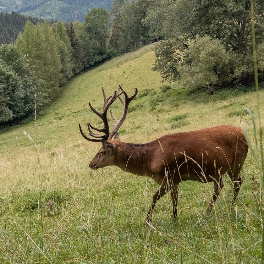
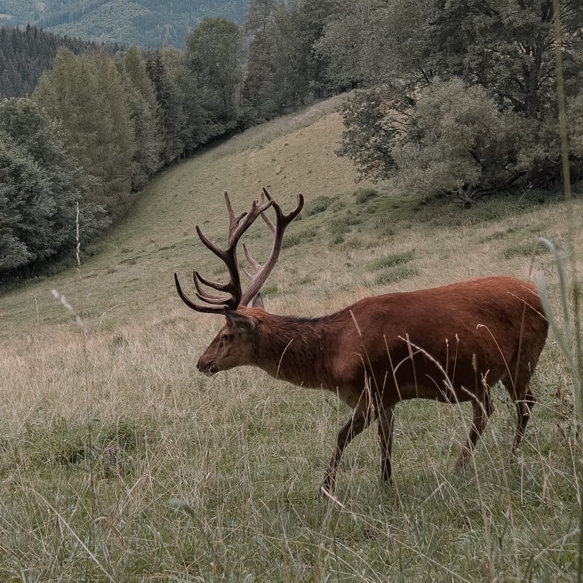
Deer in the wild (color grading)